

Designing with Grace: Ayaka Ito on Crafting Hanae, a Typeface of Classic Elegance

Ayaka Ito is an independent creative director, designer, illustrator, and type designer living in New York. She spoke with Elizabeth Goodspeed about her new typeface Hanae, her love for the hand-made, and how she brings Sailor Moon into her design work.
Elizabeth: Hi Ayaka! This is a fun opportunity for me because while we’ve collaborated several times, and were in the Type@Cooper Condensed Program together, I don’t think I’ve ever gotten to explicitly ask you about how your interest in type design started.
Ayaka: Hi Elizabeth! Getting right into it—my background is originally in interactive design. In school, I learned 3D, motion graphics, and web design, and after I graduated, I worked at a digital agency, Big Spaceship, mostly designing websites for the film industry (remember Adobe Flash? haha). But after two years, I decided to concentrate on brand identities and packaging—taking type classes after-hours at SVA. I actually studied under Ed Benguiat; in his three-month intensive “kerning” course, where we were only allowed to draw Helvetica and Franklin Gothic, using marker and tracing paper. His teaching style was very classic, which I absolutely loved!
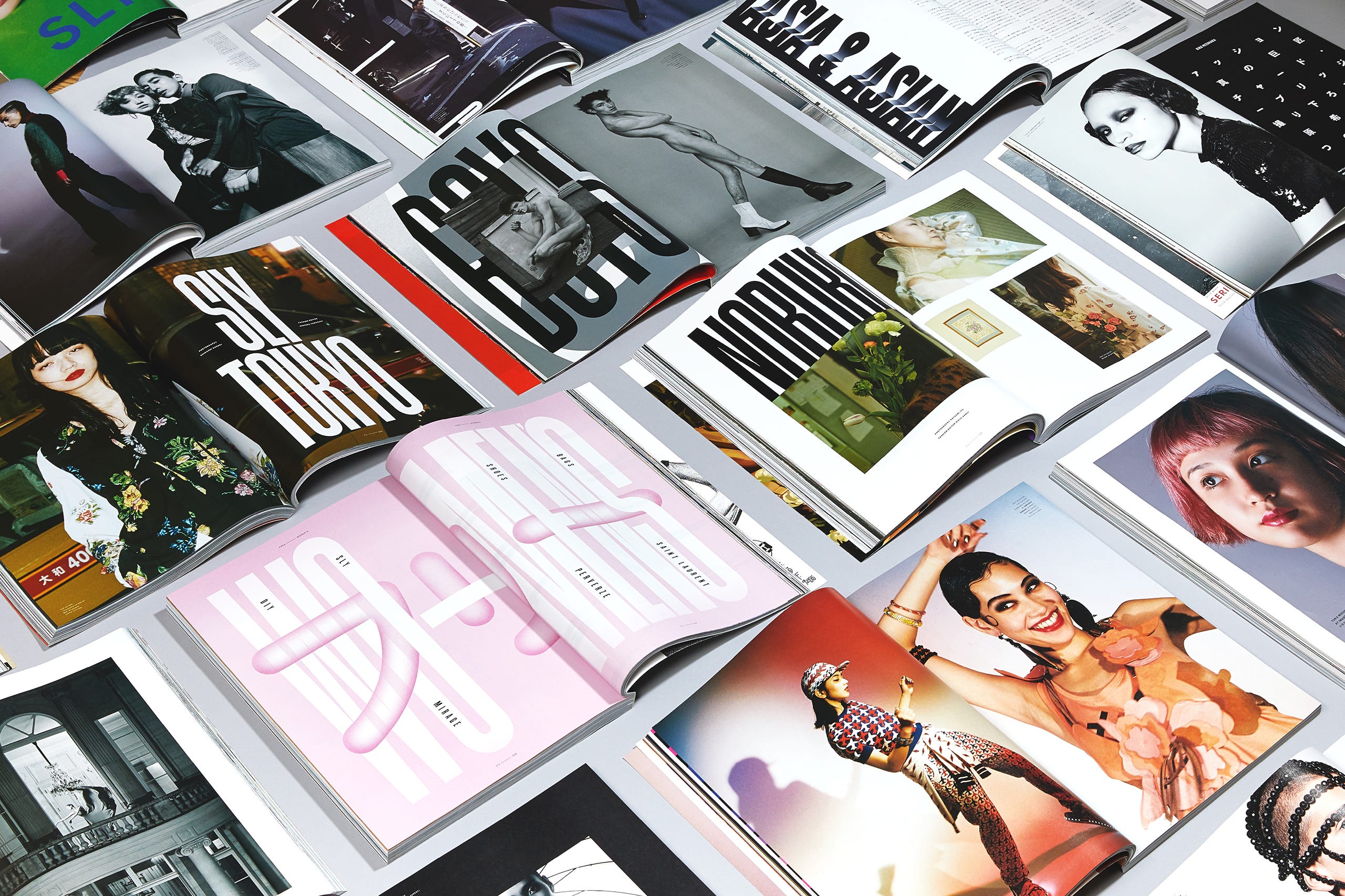
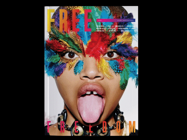
I later went on to work at RoAndCo and NR2154, getting lots more hands-on experience in branding projects, including designing logos, which is when my interest in learning how to customize type and create something tailored to clients sparked. While at NR2154, I also worked on a Japanese magazine, Free, and over time I got frustrated that we could design every element on the page except for the typeface—making me realize I really wanted to touch that side of design more in-depth, too.
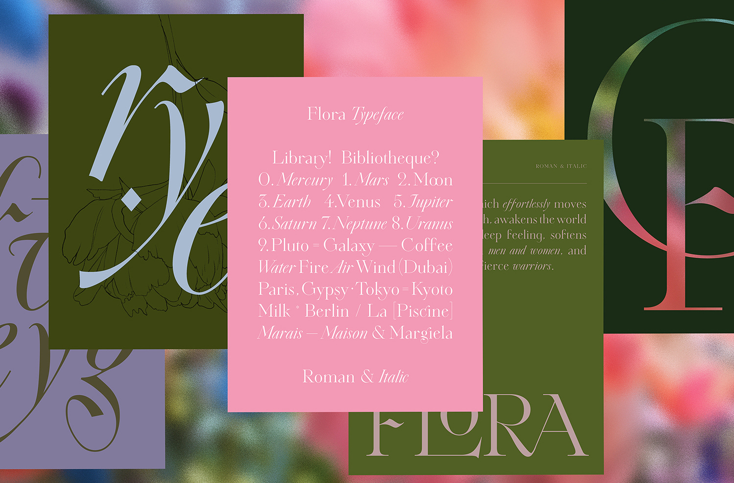
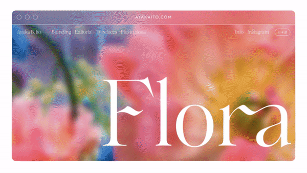
I had already heard about Type@Cooper when I was around 23, but at the time it seemed too technical and specific, and I was too daunted to apply. But five years later, with a more solid foundation under my belt, I decided it was time to take the jump. Even though I designed my first typeface, Flora, in 2014, it was all self-taught; and I wanted to officially learn from experts. And yes, that’s where I first met you!
Elizabeth: I’ve worked with you on a few projects, and it always seems like you’re interested in making as much as possible from scratch—whether that’s an illustration or a typeface. Would you identify that as something important to you?
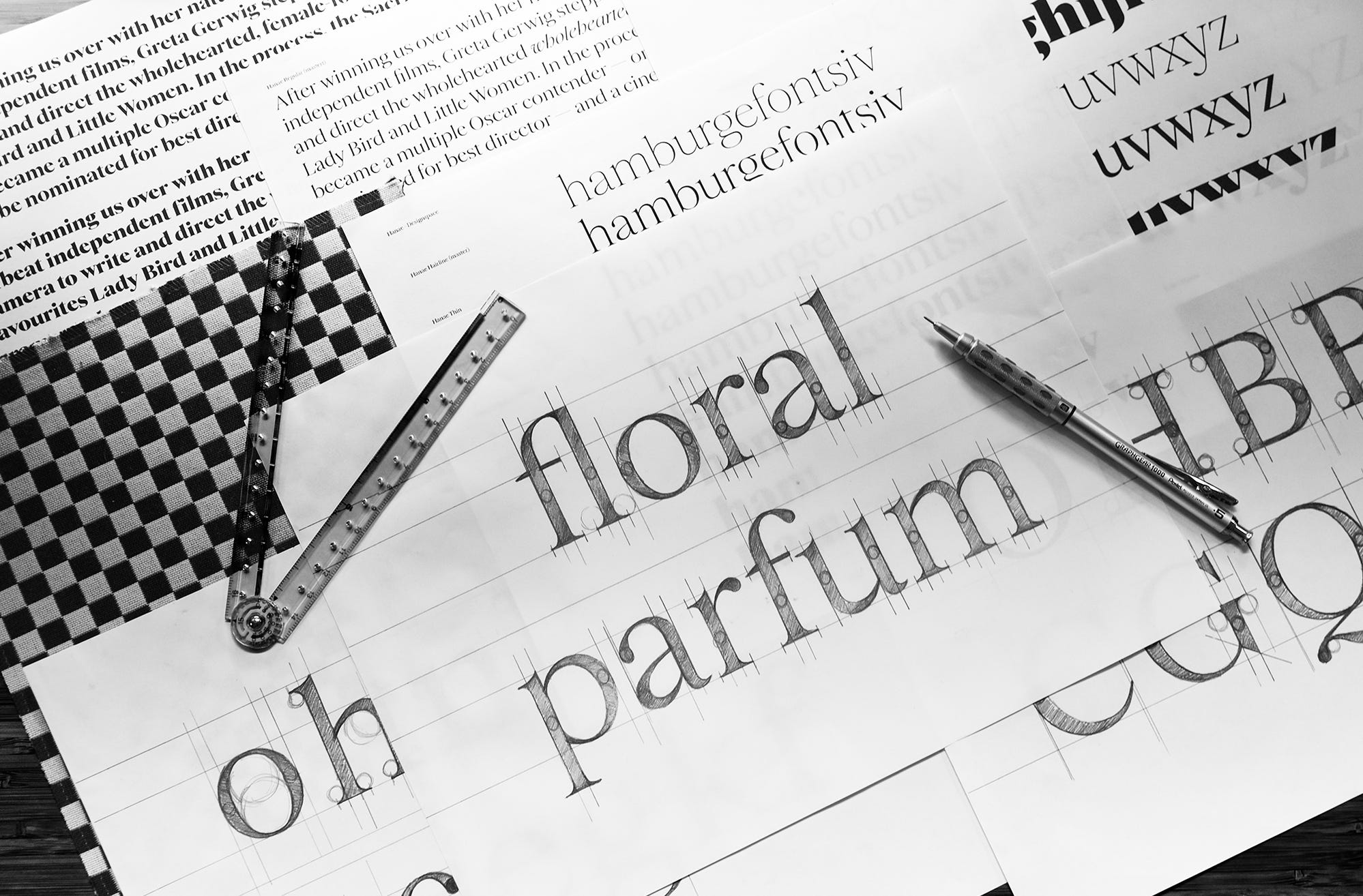
Ayaka: Drawing gives me so much peace. I always try to have my 2B pencils and piles of printer paper around. I like that when you draw something by hand, whether that sketch is good or not, it’s inevitably going to be unique because it was done using your hand. I think that’s something I learned from Hannes Famira: everyone can draw a serif typeface, in the same category or genre, but they’ll ultimately end up different just because the way one person draws, or looks at curves, is subjective. No hand works the same way as anyone else’s.
Elizabeth: I remember being in class together when one of our professors, Ewan Clayton, told us to draw with our whole arm—which made me think about the fact that it’s very different when I use my whole arm than when you do, since I’m almost six feet tall and you are... not.
Ayaka: Haha. I recently learned that I’m actually five—barely—foot one! But you’re right, the curves I make tend to be smaller as a result. I love that people can naturally express originality through their bodies.
Elizabeth: In cognitive science there’s a whole theory of visual perception called affordance—the idea that how we perceive the world is literally impacted by our physical abilities. For example, if you’re wearing a heavy backpack, that might make a hill look taller. That doesn’t really come up a lot in graphic design; how the human body relates to the actual forms.
In the case of your new typeface Hanae, there seems to be a really interesting conversation between history and the context of your own physical self. How did that process start?
Ayaka: Well, Hanae began when Flavia came to me about making a typeface geared for fashion and editorial purposes. I thought that was a great idea, and since I have experience in branding for fashion, I could bring a good perspective to the project.
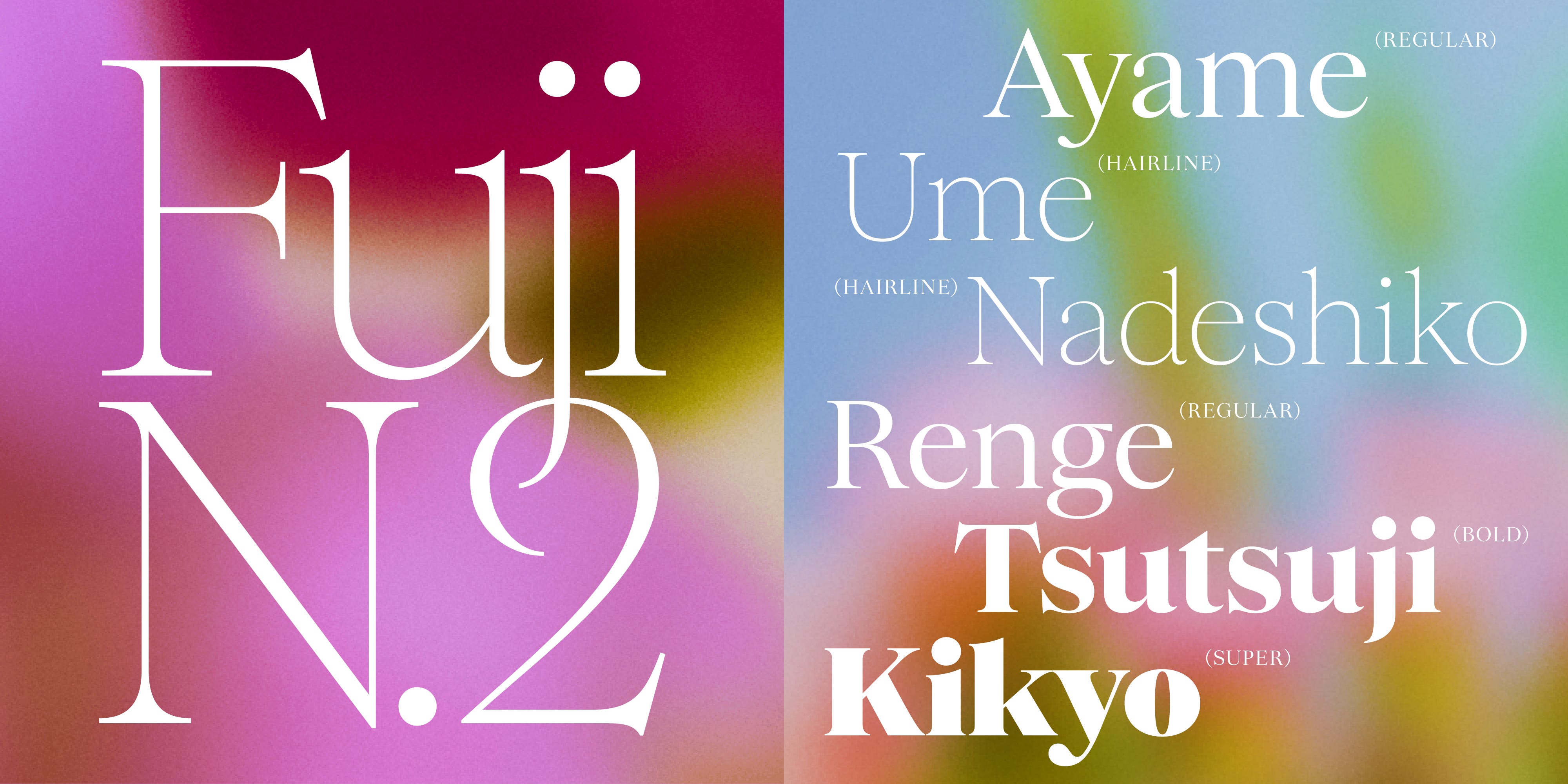
Early on, I made a mood board of its general aesthetic. I wanted something timeless and elegant. We collected a lot of type specimens from the 1600s to the 1900s. Caslon specifically was a big inspiration, particularly from the 1700s. One thing I really love about Caslon is its very round rounds—but overall the typeface is still too narrow for me. On the other hand, Flavia was interested in bringing more neutrality, leading us to also look at various versions of Times New Roman.
Funny enough, while working on Hanae, I realized a similarity between a lot of the antique typefaces, like the Caslons and the Baskervilles, they were originally made by male designers. And so even the more delicate typefaces from that period, like Garamond Light, still seem to avoid leaning too far into feminine forms. With Hanae, I wanted to dial those softer qualities up. Not too ornate, but much more gentle and graceful; a softer version of these classic typefaces.

Elizabeth: I definitely see those qualities when I look at the Hanae specimen, especially in the figures—like the way the number two kind of creates an almost closed shape, or as in the more curved discretionary ligatures. To use your word, “default”, it’s interesting how this term gets associated with more masculine forms. So, I like the idea of trying to do something that’s a little bit decorative and feminine without sacrificing utilitarian functionality.
Ayaka: Absolutely. I love that Hanae is very modest, which feels like a form of utilitarianism. For example, even the ligatures you mentioned: they’re playful, but only just enough. We really tried to strike the right balance of keeping it neutral, but fun.
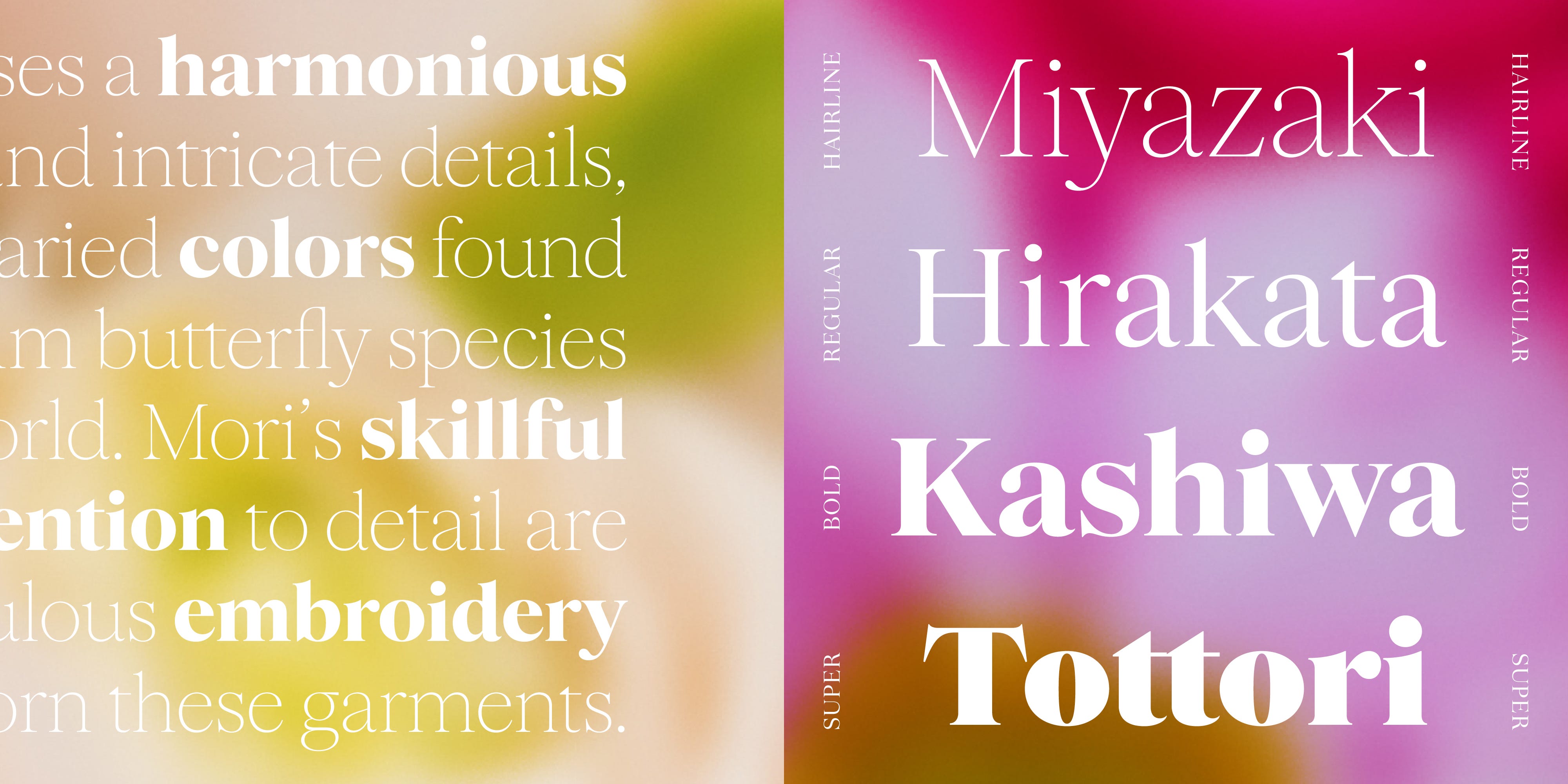
Since 2020 I’ve been designing a book for Sougwen Chung, an artist whose work is very delicate and fluid. Her practice involves a lot of unusual uses of technology, like building robots that can paint, but aesthetically it’s all very ethereal. By the time Flavia reached out about Women in Type, the book was mostly finished, but I’d switched the primary typeface a million times and still wasn’t happy. I was looking for something classical that would also work well when set fairly small, so it needed a tall x-height and a somewhat wide proportion. And when we started Hanae, I thought, this is perfect, I can finally make the dream typeface for this book!
Elizabeth: All of the typefaces released in this first iteration of Women in Type have a strong connection to history, but each of them has a very different approach when it comes to bringing that history into the present day and how, if at all, to make something feel more contemporary. What was your take on bringing these references into a modern context?
Ayaka: If you’re asking me whether I’m a contemporary gal or a classic gal, I’m definitely geared towards classic! But I do think that with most classic typefaces, a lot of the characteristics, and the feel of the letters, relate to how the ink sits on the paper when printed. In making a digital typeface, you can shift this perspective. For Hanae, we thought a lot about how to crispen it up so it felt less dated and suited to screens.
Elizabeth: I believe many designers, when approaching revivals, do the opposite, and try to replicate the softness imprinted on paper in their vectors—which, of course, can work well if you want to mimic the tactile warmth of traditional printing. That said, I think there’s something far more fruitful about the other direction, like this idea of crisping it up, where what you keep from the references is more focused on the formal shapes and the underlying construction, with modernity coming in through the details. It makes sense to me that you would apply your focus this way too, given how detail-oriented you are as a designer.
Ayaka: Flavia was a big factor in that, too. She makes some of the thinnest, most beautiful light weights, and she really enjoys that challenge. So the technical side of that crispness came a lot from her. Since I was working with the hairline queen, I thought it would be a good opportunity to try and make the lightest Hairline possible, without losing the high contrast. The fashion industry was another influence since many high-end brands use lighter, and hairline fonts in that space.
Elizabeth: Can you share a bit more about the new Version 0.2 that you recently released?
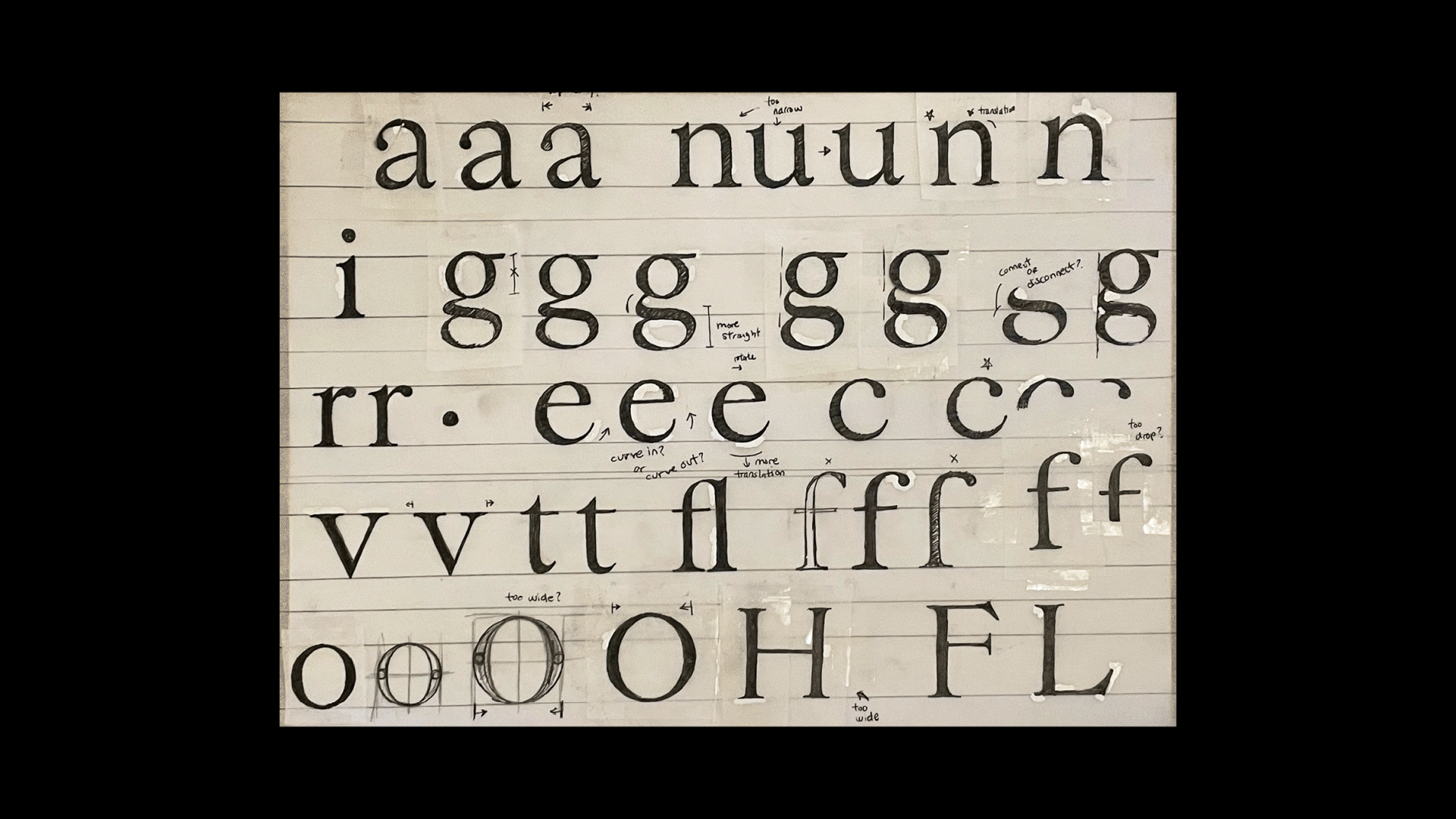
Ayaka: For Version 0.1, our goal was to establish the initial concept, but we had to make a lot of tweaks in proportions, on both Hairline and Regular masters, once we started drawing the Super. Since we had already challenged ourselves to make the thinnest weight, we wanted to do the same on the other end of the spectrum, making the Super as robust as possible. We spent a lot of time playing with the outlines to ensure cohesiveness in the complete designspace—understanding how and where we could add or shave weight in order to retain that graceful roundness in all styles. When you put too much weight everywhere, things really start to feel much bouncier!
Elizabeth: I love the Super—as you say, it really retains a lot of the delicateness despite being so over-the-top bold. What are you planning next? Are there other weights and italics coming?
Ayaka: I know it sounds crazy, but we’re not even close to the finish line! There’s a reason this is Version 0.2 and not Version 2.0. After adding the Bold and Super, which offers more versatility to designers, we plan to have a full range of nine weights, including all intermediary instances between Hairline and Super. But we’re also considering to add Cyrillic and Japanese Kana.
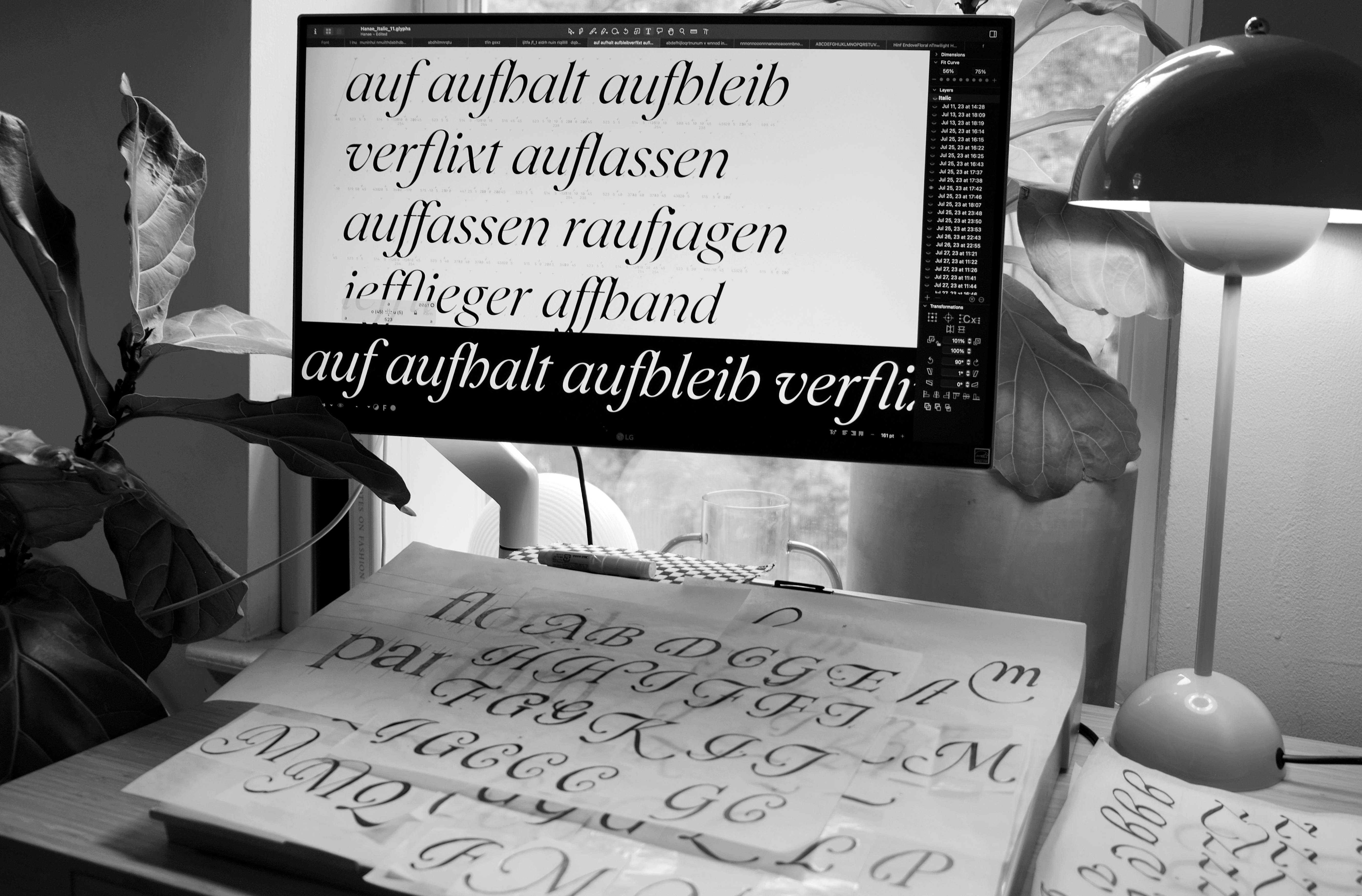
As far as italics go, like I did with the Roman, I’ve been sketching on paper first—I just find it so much easier and faster to create forms by hand than digitally. I know some of what I’m doing will be too ornate or illustrative to make into the actual font, but it’s fun and helps me define what the core foundation of Hanae really is.
Elizabeth: I wonder, did you ever take any workshops at the Society of Scribes? I took a few calligraphy classes with them where we learned scripts that remind me a bit of your sketches.
Ayaka: I have! The last I took was with Michael Sull, a master penman who teaches an incredible style of spencerian. Honestly, I should spend more time taking classes like that. There’s so much to learn from traditional calligraphy—it really helps you understand how letters work together, and where the forms come from historically.
Elizabeth: I know you describe your work as feminine, but I’m curious if you ever consider that a double-edged sword given a lot of things associated with femininity are considered lesser-than in our society?
Ayaka: For commercial projects, I only incorporate a feminine style when it aligns with the client’s preferences. But while working for myself, I don’t think it’s a bad thing, because it is an integral part of who I am.
It seems relevant to mention that my biggest life inspiration has always been Sailor Moon. In fact, the very first time I ever paid attention to type was when tracing over the logo as a kid! Both the Sailor Moon manga and show are all about embracing what it means to be a strong woman—and some of the characters are turned into men and then back to women which supports the malleability of gender a bit as well. Plus the whole aesthetic is very Art Nouveau inspired, which shows up in my work too.
Elizabeth: I love that line of thinking! The sailor scouts were all powerful characters, but they didn’t have to sacrifice their femininity to do so. Do you think that blend of cuteness and strength is something that shows up more in Japanese culture?
Ayaka: It’s been a long quest for me, not just embrace femininity, but also my Japanese heritage. During my early twenties, most of the design considered “cool” came from Northern Europe, and as a result, I tried to recreate that same European style in order to appeal to American and European audiences. At the same time, people would often comment “oh, that feels too Asian,” and they’d ask for me to make my work look less “Japanese.” I struggled with it because it would always be things that I just drew naturally, and I felt that they weren’t embraced here in the US.
I’m still learning how to tap into that side of me, and infuse it into my work. I grew up in Japan all my life and many of my inspirations come from the things, and aesthetics, I was exposed to as a kid—like Japanese food packaging or Sanrio mascot characters.
Elizabeth: Speaking more about your Japanese heritage, I know Hanae is named after Hanae Mori. Can you tell us more about her? What’s the relationship between her and the typeface?
Ayaka: Hanae Mori was one of the first Japanese fashion designers to become prominent in Western culture. She had a couture house in Paris in the 1970s and sold clothes in New York as well. She was a big figure in my grandmother’s generation; when a lot of people still wore kimonos everyday, but Mori found a way to bring Western-inspired clothes into Japanese culture. Her work wasn’t too flashy—it was graceful, something you could wear to a nice dinner or a special occasion.
We came up with the name while refining the initial release, and thought the softness we wanted to convey resembled her aesthetic; something fashionable but not too contemporary. Classical fashion.
Elizabeth: It seems like a really nice parallel for your Hanae typeface, blending your own personal identity as a Japanese designer with a classical Western typeface like Caslon.
Ayaka: Definitely. She paved the way for so many other Japanese fashion designers that are icons now too, like Rei Kawakubo of Comme des Garçons. I really aspire to be like her, where I’m able to blend influences from both my cultures, Japanese and American, by existing somewhere in the middle.
Elizabeth: That makes me think of the point you brought up earlier, that there are innate characteristics about each of us, like the body we’re in or the culture we grew up in, that are going to come through in our work. You can fight them, or you can lean into them, but ultimately I think it’s about finding a sense of ownership.
Do you feel like there’s been any shift in the industry in so far as people asking you to make things less “Asian”?
Ayaka: I had a client who found me by googling “Japanese graphic designer in New York City,” so there are definitely people looking specifically for that perspective! On the other hand, I think I’m more comfortable with who I am now.
I know it’s a heck of a lot of work, but I want to dive into Japanese type design more earnestly. Over the past few years, I’ve started practicing drawing kana characters, and have built an extensive collection of vintage Japanese calligraphy and lettering books, some dating back to the 1600s. Sadly, I noticed there aren’t as many educational resources available for drawing Japanese characters compared to Latin. The three scripts, Hiragana, Katakana, and Kanji, all have different histories and forms you need to consider when creating a typeface. But similarly to Mori—I would love to bring influences from both cultures to Hanae, and a multi-script typeface is the perfect playground for it. I can’t say when it will happen, but I am excited!
✷ Footnote: Touching on the shortage of courses and resources covering other scripts rather than Latin, check out the amazing initiative Words of Type led by French-Chinese type designer Lisa Huang. The campaign is ongoing on Kickstarter with the goal of publishing a free online encyclopedia of typographic terms, illustrated and explained in multiple languages. Aaaaaand you can pledge to lectures and workshops covering Arabic, Devanagari, Thaï, Hanzi, Hangeul, Japanese (Hiragana & Katakana), Greek & Cyrillic.